 As our first task, we analysed Daft Punk as a whole class. For their album name cover, I noticed that there was a black solid background and that it made the doll head that was half silver and half gold stand out more. Also, the font was quite interesting and eye catching. In their album teaser trailer, I also noticed there was a dark background and that helped me to focus more on the screen that was being shown as I was very bright. In their music video 'Get Lucky', The symbol appears once again and there is again a dark background.The clothes that the artists are wearing in the video are very bright and shiny and therefore contrast the background massively. This means that we are more aware of the artists and they become the only focus in the video. The original version of 'Get Lucky' also has dark elements. The video begins in black and white and further along, it turns into a sepia type effect. Later on, it turns normal and again the robot heads are present.
 After finishing the class analysis of Daft Punk, we individually picked 4 different album covers as well as songs to analyse from the list we were given. The first one i chose was Wretch 32. Wretch 32's album cover name is black and white. I analysed the cover and i noticed that it was black and white. The background was white and wretch 32 was dressed in what came out as grey and black, so presumably they were considerably dark colours. Also, he is the only thing on the cover of his album, there are no objects or instruments with him. I then analysed the magazine advert of black a white. Apart from also being black and white and having the same picture on it, it also has some text. The font is in black and it grabs our attention as it is placed on a white background. I then also analysed the album release promo video of black and white. I realised that the magazine advert was in the video and at the beginning of the video, Wretch 32's name comes up in the same font as it does on the album. The font of the features information and the song names at the back is the same and different to the rest. Throughout the video to his single 'Don't Go', Wretch 32 only wears black. All the other people in his video are wearing either black or white and once again at the beginning and at the end of the song, his name appears in the same font.
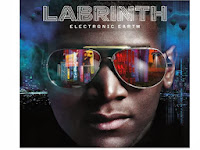
 After Wretch 32, i decided to analyse Labrinth. I analysed Labrinth's album cover first. The first thing that caught my eye were all the bright and electronic colours used against the relevantly dark background. I also noticed the sunglasses as they are quite big and reflects the colours and images of the album. I noticed that the font of Labrinth's name is different to the electronic type font of the tracklist and the name of the album. It is a perfect font as the album's name is 'Electronic Earth' and the font looks extremely electronic. After analysing this, I looked his music video to 'Let the Sun Shine'. Once again, the glasses appear and since to be used various times throughout the video. Also, there is again a use of bright colours, often against this electric navy blue background or what he is wearing, that contrasts the bright colours, as occurs on the album cover.


 My next choice was Emile Sande. I decided to analyse her as her genre of music is quite different to the ones I had done so far. I began by analysing her album cover 'Our Version of Events'. The album cover uses very neutral colours and has quite an old, rustic feel to it. Two things that stand out a lot is her hair and her clothing. I noticed that her hair is very blonde and is always styled in this way. It seems to be one of the ways by which she is recognised among other artists and is like her trademark. In contrast with her hair is her dress. It is black and filled with roses which is also adds quite a rustic feel to the cover. I then analysed her her music video to her song 'Next To Me'. Again, her hair is in the same style and is still very bright blonde. She is also wearing similar colours, which are quite neutral at first. In her second video that I analysed, it was in black and white and she was the only person in the video wearing black. Also, her hair was again styled the same and was the same colour, which stood out immensely in the black and white effect.
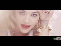
 My final choice was Rita Ora. Again because she has a different genre compared to the artists I has already analysed. I looked into her album cover 'Ora' and analysed that. I immediately saw that the album was black and white. However, the one thing that stood out was the use of red on her album. Rita Ora is known for her red lips and her use of red. The significance of having that on her album shows that it is her trademark. I then looked at the video of 'RIP' featuring Tinie Tempah. I again saw the use of red not only on her lips, but also in the two different cars she used in the video. Also, she always wears quite big chains and we are able to see that in both her album cover as well as her video.


MY OWN CHOICE:
I decided to do my own research on Rihanna as I enjoy listening to her music and think she is a complete artist. As I looked into Rihanna latest album 'Unapologetic', I realised that the album was all in black and white. The only thing that was not in black and white throughout the album was her body. I think Rihanna is constantly changing her image and lately she has been focused on diamonds and that has become one of her trademarks by which she is associated to all around the world.
.jpg) As we can see on the front of the album cover, we can see that there is an image of the diamonds. If we then look at her tracklist, we can see that her debut album is called 'Diamonds'. The back of the album is also in black and white and she has short hair in both images.
As we can see on the front of the album cover, we can see that there is an image of the diamonds. If we then look at her tracklist, we can see that her debut album is called 'Diamonds'. The back of the album is also in black and white and she has short hair in both images. 
This was a promotion leaflet that I found for Rihanna's album 'Unapologetic'. Her notorious 'R' is on there which is her trademark and it is also in black and white apart from the added on writing from the promotional information.
In Rihanna's single 'Diamonds', the video starts off in black and white. It also shows actual diamonds as well as showing off all of her tattoos which she is also known for, as all her videos also do.
In all 3 products, we can see her tattoos as well as the input of the diamonds, which is now her latest trademark. Rihanna is known for her tattoos therefore it makes perfect sense to constantly show her tottoos and it now also makes sense to show the diamonds as she has also made that one of her trademarks.


No comments:
Post a Comment