Showing posts with label Joel Ryan. Show all posts

Thursday, 23 January 2014

Evaluation Q4 - What have you learnt from your audience feedback?

What have I learnt from Music Video feedback?


Taija felt we generally had a good Music Video  overall. She commented on all aspects of our work ranging from Karma's performance to the editing of the music video. In the second video many of the same comments were reproduced, for example Dionne said '' she liked the way our editing matche the beat of the song'' and Ruth said ''she liked the way we put together the shots of Karma picking the graffiti rose off the wall'.


What have I learnt from Ancillary Work feedback?
                                                                   
Nyomi


Masum


My Response to the ancillary feedback?


The main things I learnt from my Ancillary Work feedback were:

  • I learnt the importance of incorporating the synergy products into all ancillary work because it helps to develop a visual link between the music video and ancillary work.
  • I learnt I had a good understanding of the conventions of Ancillary Work because people had said I had followed all the conventions of the video.
  • I also learnt that it was extremely important to use the same fonts and colour scheme throughout my work because that way all three pieces of work (Digipack, Advertisement and Main)
  • However there was some improvements I could have made for example some of the target audience said I played with the the sharpness of the images to much. So from that comment I guess I can say I learnt  using editing equipment to much can be more detrimental to your work because then it starts to look over done.

Tuesday, 21 January 2014

Evaluation Q3 - How did you use media technologies in the Construction, Research, Planning and Evaluation stages?

How did I use media technologies in the “construction and research’’ of my Music Video and  Ancillary Work?


Music Video - Construction
  • High Quality Cameras – Without using the cameras in the construction of Group 23s Music Video it would have not been done. So personally I think it was the most important piece of technology related to the construction of the Music Video. We used the cameras to film the entire three base tracks for our Music Video and we also used them to film extra clips which we would add in when editing our video.
  • Final Cut Pro – Final Cut Pro was used for the editing process. I used final cut pro to cut the length of the clips we had filmed and I also used it to edit the colour, brightness, sharpness and contrast of the video footage. An example of this from the music video is when our artist picks a graffiti rose of the wall and it comes to life.  As you can see from the clip below before Karma had picked the rose of the wall the video was is black and white, but as soon as she begins to pick the rose off the wall the whole video fades to colour.
  • Final Cut Pro – Another editing technique we managed to use in our Music Video using Final Cut Pro was the whip spin when our Artist Karma hit the camera in one location and as the camera pivots to the right it fades into another location where she catches the camera and continues to perform. I did this by cutting the clip where Karma slapped the camera in the first location half way through and then moulded it to the clip where the camera spins in the second location. After this I added a fade where the two clips joined.
Ancillary Work - Construction

  • Photoshop – Photoshop was a very important piece of technology I used in the construction of my ancillary work. I used specific tools to tweak the brightness, sharpness, contrast and colours of the images present in my ancillary work. An example of this is when I played with colour red on all the images in my Digipack and advertisement. I wanted to make the colour red boulder throughout my work as it was my synergy colour. This was especially effective on the red lipstick which is one of my synergy items. 

  • Photoshop – Photoshop was also use to edit the actual quality of my images. There are numerous filters which can be applied to images to enhance how they look. Intially I decided to add a filter on to the main image on my advertisement and the front of the digipack. The specific filter I used played with the sharpness of the image but I felt it became to blurry, so I decided to play with the filter settings until I got it just right.


Music Video - Research
  • Internet for Research – Youtube was used a lot during the researching process of my music video. I used it too look at music videos of artists similar to Ellie Goulding. This was extremely beneficial because it gave me idea on how authentic music videos are meant to look like. Examples of videos I analysed were: Rita Ora – R.I.P and Katy B – 5AM.  When analysing videos on youtube I also used the suggestion bar to watch numerous videos from each artist.

  • Internet for Research -  I also use a website called Vimeo because multiple videos of past students work has been uploaded. Therefore I was able to look how lower budget music videos were to be created. This was useful because the music video Group 23 was making had a budget of nothing. Because we didn't have a budget we couldn't try to recreate a high budget video, so we to compensate for the special effects and editing equitment which wernt availible to us.
Ancillary Work - Research
  • Internet for Research – Various online fan sites were used in the research of my ancillary products. On these websites there are pictures of the artists digipacks and advertisements which means I was able to have a look at what a professional digipack and advertisement should look like


How did you use media technologies in the'' planning and evaluation''  stages of my Music Video and Ancillary work?

Music Video - Planning and Evaluation
  • Webcam and Vlogs - A peice of technology I used in the planning stages of the music video was the computer webcam to create video blogs. I used the video blogs to talk about what me and the rest of the group intended to do for the costumes, locations and props we needed to create are music video. It was also good to add some variation to how we displayed our ideas and work because we would not have been encoporated many different technologies in our blog.

  • Flip Cams - The Flip Cams was a very important peice of technology when it came to evaluating Group 23's Music Video. We used them to film a variety of peoples responces and feedback and then from the feeback we gathered we was able to base our final evaluation points around it. An example of when he flip cams came into great use was the day we went to Screen on the Green to watch all our Music Videos. After the videos was filmed, we were able to get great amounts of feedback.

Ancillary Work - Planning and Evaluation
  • Photoshop - Once again Photoshop was an excellent peice of technology to plan my Digipack and Advertisement.  I was able to use the program to create a digital mock up so I could get the layout and font style of my work perfect.This was beneficial because I found out that my initial ideas about my layout were not conventional and did not look right on screen. Also because photoshop has a variety of fonts styles installed on the program, I was able to mix and match fonts to see if they went well together. 
  • Flip Cams - As mentioned before, the flip cams are a great peice of technology for evaluation purposes, because you can analyse the feedback you recieve and make rational conclusions. When evaluationg my Ancillary work, I went round showing people my work and then recorded their responces and feedback. This was useful because I was able to capture the feeback aswell as their facial reaction from viewing my work.

Saturday, 18 January 2014

Evaluation Q2 - How effective is the combination of your Music Video and Ancillary Products?


In evaluation I believe the combination between my Music Video and my Ancillary Work is very successful because I have recieved a good amount of positive feedback which I will talk about more in question 4. When Group 23 was planning for our Music video, it was decided that we were going to use two main synergy products which would link our Music Video to our individual Ancillary work. We decided to use a red rose and red lipstick. The reason we chose red was because it is an colour which symbolizes two main emotions; love and anger. We felt this worked perfectly because the song we had chosen was a love song but at the same time the lyrics suggest that the song writer is angry over the break up. Throughtout the video our artist Karma wore red lipstick and was holding a red rose in all of  the basetracks as you can see below.


To make a vital connection between the main and ancillary texts, it was obvious that I needed to use those synergy products in all of my Ancillary work so that my target audience would be able to recognize them as linked products. I think it is fair to say that my audience can recognise my work as linked products because of:

  • The use of the Rose and Red lipstick in all of my products
  • The same poses are used in video as well as ancillary work
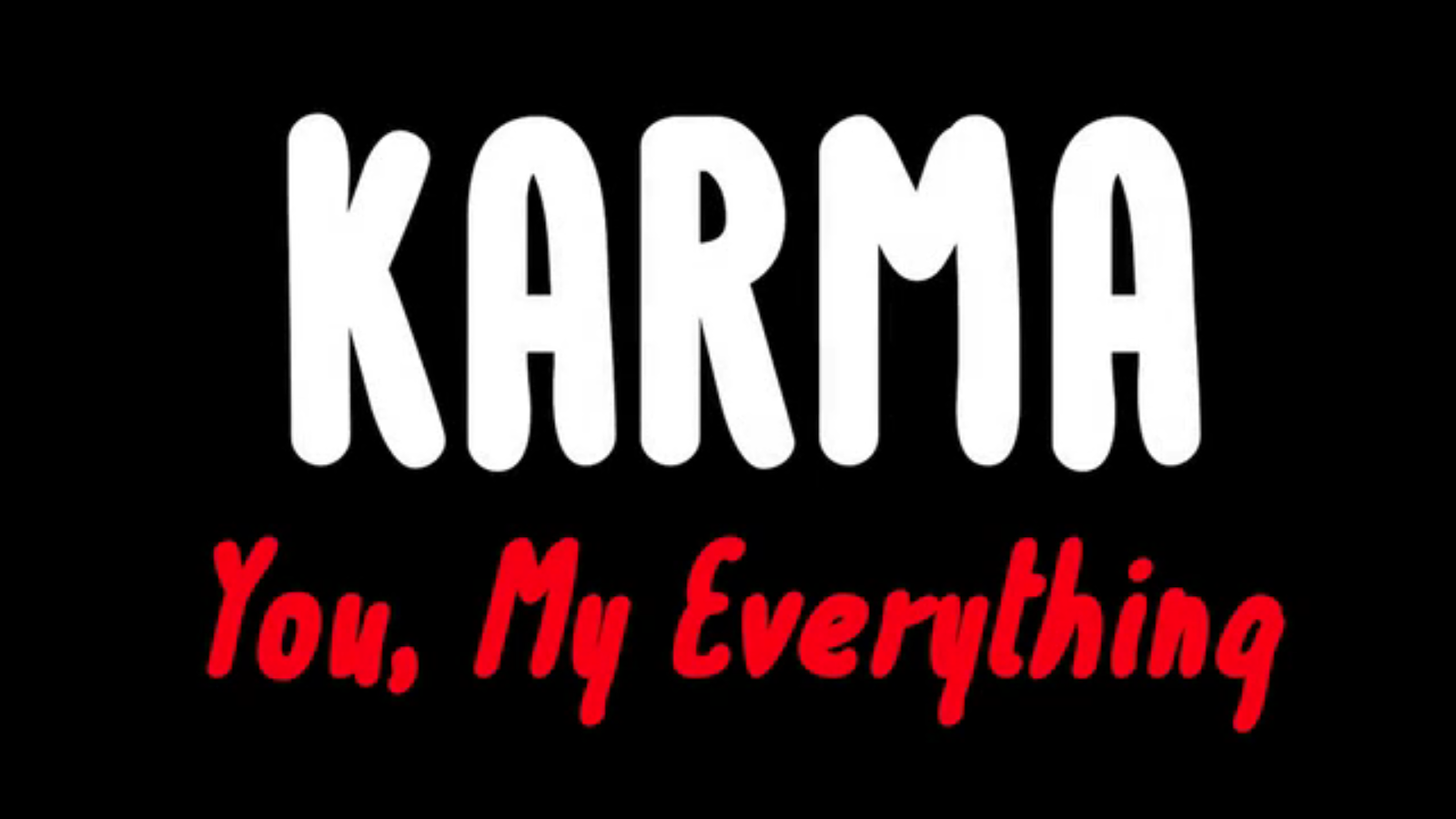
  • The font used at the beggining of the music video has been used on all the ancillary work aswell
  • Colour Scheme
  • Karma features in all of the pieces of work
As you can see from the images above the fonts used in the main and ancillary texts are basically the same, but I did add extra gradient to the text in my ancillary work. This means as soon as my target audience watch the video and see the ancillary work they will know the peices are connected because the font I have used is very memorable and stands out.

It was also important that my Digipack and Advertisement were easly linked together because if they wernt it would have been pointless trying to link them to my main product. To make sure they were linked, I also followed a strict colour scheme which was made up of black, white, grey and red. This colour scheme also featured in the music video at times.

Thinkning back to the planning of our music video ( Costumes and make up), I think these are also aspects which link the main to the ancillary products. This is because if you look at my ancillary work you can see that our artist Karma is wearing similar clothes to the costumes in the video and has similar make up on. This means her overall style and image has remained the same in the main and the ancillary work. This is an obvious connection between the two because it shows that her image throughout her music and ancillary texts are consistent.

Finally I think my target audience will be attracted to my main and ancillary texts because they are both Urban ( Costumes, Locations and Fonts) as well as Pop ( Filters, Airbrush and Special Effects). Because of this I would say that all my work fits the expectations of the genre which means the specific target audience is bound to be attracted to it. I know this because when researching for my pitch I found that Urban Pop fans expect to see well known urban brands and locations as well as relatively bright pop colours i.e red.

Friday, 17 January 2014

Evaluation Q1 - In What Ways Does Your Media Products Use, Develop or Challenge forms and Conventions of Real Media Products?

Music Video Conventions 

From watching and analysing Group 23's Music Video a number of times, I would say that we have followed the conventions of Music Videos. Carol Vernalis stated that the editing found in music videos is much more obvious when compared with the editing found in films. She also stated that music videos contain disjuncture in a rhythmic basis. 


Her overall conclusions were:
  •  Obvious Edits – Jump Cuts, Transitions (Wipes and Special Effects) and Fades.
  •  Rules of Continuity editing are broken
  •  Base tracks are used to add structure

An example of Group 23 following the convention of Obvious edits is the rapid jump cuts we have used in our music video when the beat begins to drop. We took this idea from Beyonce - Baby Boy and I used Camtasia to present it. 
 

The flickering in our Music video helped to add structure because it featured twice so in a way we followed Andrew Goodwin's suggestion that music videos have no sense of closure or ending. Instead it build up to a climax and then fades away and then repeats the process. This is what we done.

Since we have used so many Jump cuts through out our music video, it suggests that we have broken the rules of continuity editing which means we have followed another convention of music videos, because the rules of continuity editing are often broken in music videos. Below is an example take from our music video of Jump Cuts used:

Another convetntion of music videos Group 23 followed was the idea of Base Track Editing. As mentioned earlier, Carol Vernalis stated that music videos often contain base tracks to add some sort of structure to the music video. We have done this in are video, by using three main base tracks.


We also followed many of the music video conventions Andrew Goodwin suggested in his theory of Music videos. His stated that music videos had no sign of closure or ending. Instead they will build up to the climax of the song and then fade away. This process would be repeated throughout the music video. From watching Group 23's Music video, I can definately say that we followed this convention. Our song started of very slowy and so did our music video. As the pace of the song increased are edits became more frequent and faster. Then as soon as the beat dropped the song began to slow down once again, and so did our editing pace. This was the pattern which we followed throughout are music video.


Also our Artist Karma made sure she looked and sung directly into the camera when filming are music video. This was another convention suggested by Andrew Goodwin. Which is why we decided to follow it. Also by doing this, we did gain a lot of positive feedback because member of are target audience said that Karma's eyes drew their attention inwards.


Finally we also followed the idea of Amplification in our Music Video. This is when music videos introduce new meanings that do not contradict with the lyrics but add layers of meaning. We done this through our shot types and Karma's performance. For example the lyrics of the song are quite saddening which is why when Karma was performing she had to show that emotion.


Ancillary Work Conventions followed

The codes and conventions of Ancillary products can also be described as the expectations the fans have for that music genre. This means sometimes depending the music genre the conventions can vary. Because our aritst was an urban pop artist, we would have to follow the conventions of a pop stars ancillary work. Furthermore are target audience would have generally been young adults and teenagers.

The main conventions of a Pop Stars Ancillary work are:

  • Layout
  • Colour Scheme
  • Use of Image filters
  • Fonts
  • Similarites between Digipack and Advert


Rita Ora's Digipack did inspire the colour scheme of my Digipack because I used red, grey, white and black as my main four colours as you can see below:


However when it comes to layout, my Digipack has followed all the conventions unlike the Rita Ora's one. I have positioned my tracklist in the middle of the back cover, barcode in the bottom left, record lable in the bottom right and copy right in the middle at the bottom of the cover.  I did end up tweaking the pictures I used in my final digipack by adjusting sharpness, colours, brightness and the contrast of the image. So I guess I can say that I did use an filter on my image but I created it myself rather than using one of the presets.

Another convention that my Ancillary work followed was the similarities between my advert and the inside and outside of my Digipack. Throughout all the peices of my work, I have used the same fonts and colour schemes so straight away you can see that all three peices are for the same artist. This is important because not only do the peices of work have to be related to one another, but they also have to fufil the expectations of the fans. So if one peice of work appealed to the fans and another didnt this means I would have contradicted one of the main conventions of ancillary work.

Overall I would say I followed all the main conventions of Music Videos and Ancillary work and used them in a relatively good way because the Music Video Group 23 managed to produce looks authentic and so does my ancillary work which I am pleased about.

Production of My Ancillary Work - My Final Advertisement


Production of Ancillary Work - My Final Digipack

 Outside


Inside 


Production of Ancillary Work - Target Audience Feedback

Nyomi


Masum


Friday, 10 January 2014

Productions of Ancillary Work - Screenshots Of My Advertisement

Advertisement Screenshots


I have been using photoshop and it's effects to alter pictures and text further. For example I have used gradients, embossing and strokes to make the text stand out. Also I altered the brightness, contrast and sharpness of my images.

Production of Ancillary Work - Screen Shots Of Digipack and Advert in the Making

Digipack Screenshots


I have been using photoshop and it's effects to alter pictures and text further. For example I have used gradients, embossing and strokes to make the text stand out. Also I altered the brightness, contrast and sharpness of my images.

Wednesday, 18 December 2013

Planning of Ancillary Products - My Pitch

Last Wednesday before I started my production work I had to pitch my ideas to my teachers and explain how I was going to execute them. This was so we could be notified if there was anything wrong with our initial ideas and make sure we would follow all the conventions of ancillary work. During the pitch I was informed that images which we had not taken ourselves could not be used in our work due to copy right so some of my ideas had to be changed. apart from the back of the digipak nothing else has been changed to date.


My original idea of having red roses on the back of my digipak was changed. This is because I did not take the photo of the roses myself and after some feedback I felt that their was too much red for my liking. So I decided to change it. Underneath is what it looks like now:


Saturday, 14 December 2013

Production of Ancillary Products - Where Have My Ideas Come From?

My initial ideas came from looking at a range of digipaks, including artists like Rita Ora, Katy B, and Ny. They are all reasonable urban artists which means their ancillary work would be similar to what I would produce.

Combining all together I though I would be able to produce something urban as well as professional.

Planning of Ancillary Products - Mock Up of Advertisement


Planning of Ancillary Products - Mock Up Digipack


Planning of Ancillary Work - Why We Choose These Picture Locations?


The main reasons we choose these locations were:
  1. We wanted to use a play background for editing purposes. Many tools which are available to used on photoshop work much better if the background around the artist is blank.
  2. We chose the black studio because it was a professional area where pictures are meant to be take. Also we could also manipulate the weather for effect e.g. using the fan to create a wind effect in our pictures.
  3. If we want to use simple but effective colours on our Digipaks photoshop will be able to easily pick up the colour of the pictures background and paste it elsewhere
  4. We choose to take our pictures indoors because it is much easier to control lighting inside as the light is not natural. To get professional looking pictures the lighting has to be correct to eliminate shadows.

Planning of Ancillary Products - Karma's Costume!!!

Karma's Costume

Karma's Photoshoot Description
  1. Black Jacket
  2. Black Vest
  3. Fur Scarf
  4. Bright Red Lipstick
  5. Straightened hair
 The picture above shows what our artist will be wearing in our Digipak and Advertisement. The red lipstick is our synergy product so it definitely has to be in the pictures we use, as it acts as a direct link to the music video Group 23 produced.  The black jacket and straightened hair were both used in our ''Houndsditch'' basetrack which is why Karma wore them for the photoshoot. As you can see our artist is also wearing a chain which represents the urban side of her since many urban artist use jewellery as a symbolic item. The new editions to our costume are the black vest and also the fur scarf. Pop artists often wear excentric clothing the music videos and photoshoots, so we decided we will do the same in ours as we did make a video to an Urban Pop song.

Researching Ancillary Products - Magazine Analysis UNFINISHED

Rita Ora - Radio Active


As Rita Ora is an Urban pop artist she already has a lot in common with our Urban Pop Artist called Karma.  From looking at her magazine advertisement for her Radio Active tour, her design, layout and colouring all comply with the conventions of Urban Pop. First of all from looking at the font you can see it is relatively urban and the pinkish background is very pop like. So having the font and and background together creates the Urban Pop effect. Furthermore the effect on the picture has also been given a stylised pop music genre airbrush. I have though about using similar effects on my ancillary work.


Ellie Goulding - Lights


As we choose an Ellie Goulding song to create and a music video for and base our ancillary work around, I thought it was a good idea to analyse an Ellie Goulding advert to find similarities between my ancillary work and also Ellie Goulding. 

Planning Ancillary Products - Short List of Digipak Photos


The reasons the pictures above have made my short list is because I like the shot distance and pose our artist Karma has done in the pictures. Also all the pictures are of a good quality ( although some quality may have been lost through uploading). Also all the pictures feature the bright red lipstick which was one of our synergy products. Also I believe plain backgrounds look good for ancillary products because often you do not need to cut around your artist which does not look very professional.

Planning Ancillary Products - Do's and Don'ts of Design Work

Things you should do:

  • Use a picture of your Artist on the front
  • Use a maximum of 2 fonts which are easy to read
  • Use a maximum of three colours on you Digipak and Advert
  • Use a good number of relevant song
  • Use reviewing magazines relevant to you genre
  • Use synergy which relates to you video

Things you should avoid:

  • Too many colours
  • Fonts which cannot be easily read
  • Irrelevant music reviewing magazines
  • Using pictures to fill blank spaces
  • Using stretched or bad quality images
  • Making your work look like its been made for different artist- follow the same theme in all your production work

Researching Ancillary Products - Short list of font, colours and Layout

Fonts 
From the time we finished producing our Music video we had already decided which font we was going to be using on the rest of our productions work. This font is called Mix Tape and features in our music video. Here is a picture below:

Although this is the main font which will be featuring on all my work, I think I may use a supporting font aswell, but at this moment in time, I am still contemplating. If I do use a supporting font, it will still be urban aswell as a little more fancy.

Colour Scheme

The colour scheme which I thinking about using is red, black and white. The red has been especially chosen because its the colour of our synergy products: the red lipstick and roses. I have chosen black and white because these two colour go with virtually anything, so there will be limitations to what I could so with them.

Layout
I am thinking about using a standard layout to any other Digipak. I will be using the 4 panel template. This will be explained deeper when I blog about my mock up.

Researching Ancillary Products: Analysis of Three Digipaks

Ellie Goulding - Lights 

This Digipak initially relates to our genre of urban pop because we choose an Ellie Goulding song to make a video to and it was classified as urban pop. Besides that You can see its a Digipak of a pop artist because of the effects used. The sparkling light effect is something which would be found in a lot of pop music video's. Personally I believe the colour scheme used is what makes it seem and look urban, which will make it urban pop like our genre. The dark blues and blacks contrast with the bright lights which give the impressions the artist is urban and real, but also makes pop music. This will relate to the audience due to factors I mentioned before; darker colour scheme to urban fans and the special pop effects to the pop fans.

Marina and the Diamonds

This relates to my genre because firstly Marina and the Diamonds is a pop artist who covers a wide range of pop sub genres. The actual design of the Digipak has an Urban feel and I think this is because of the font which has been used. Also the colour scheme is quite simplistic which makes it feel like the artist is a little less mainstream. Personally I think this is unusual for a pop artist because normally they use much brighter colours in their work. The effects and poses in the pictures relate to the audience because they stand out. Pop videos generally try to make the artist look glamorous and that has been done on this Digipak.

Rita Ora - Ora

Rita Ora is an upcoming urban pop artist. You can tell this by the way she dresses and speaks. Also from analysing her Digipak the colour scheme and font once again relate to our music genre, audience and music video concenpt.  The red, black and white works well and was the colour scheme I was planning to use on my Digipack. Furthermore the font is almost graffiti like which is something which urban artists use a lot in the work. Therefore because of these reasons it would relate to our target audience.